SprintBeans
Identity and stationery design for an investment portal for users belonging to age group of 25–35 who are new to investing.
Identity Design, Branding
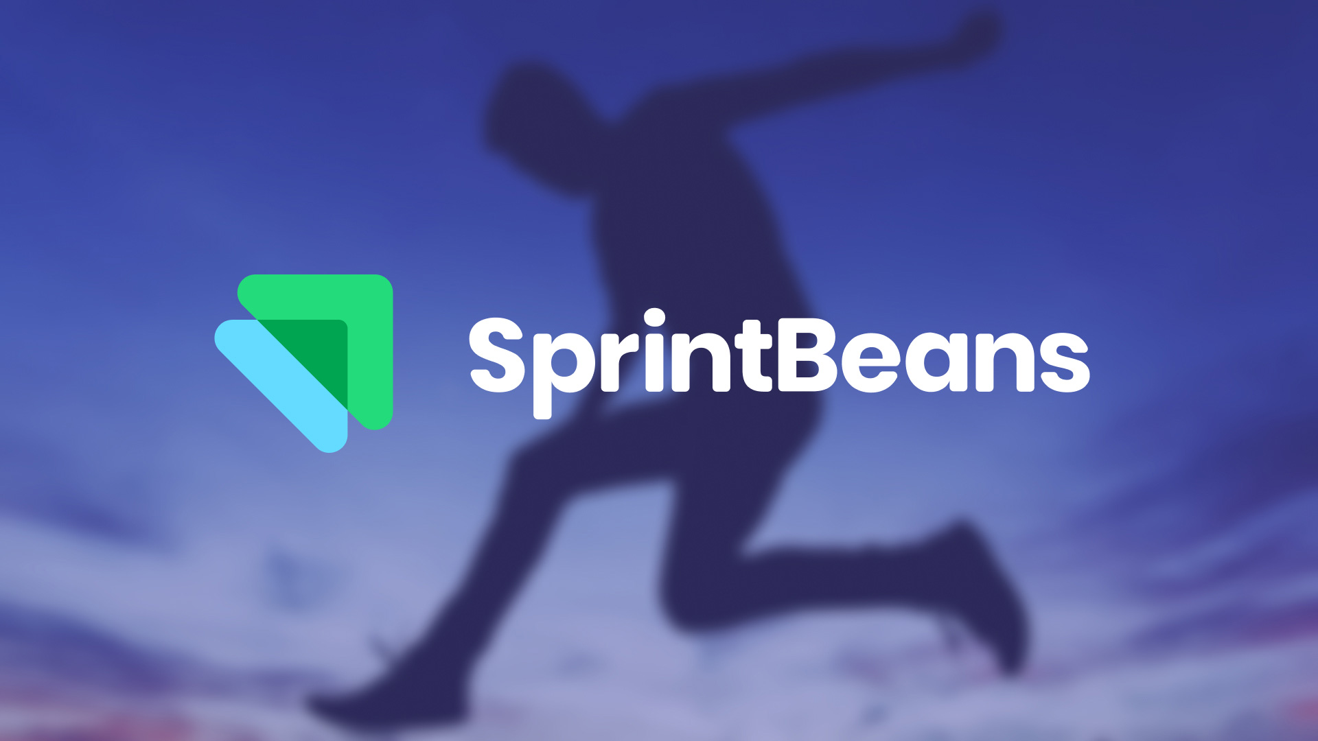

The brand identity evokes a feeling of trust and growth while also being playful and casual to suit the target demographic. The fusion of Vivid Green and Light Blue colors results in Dark Green which indicates transparency within the brand and formation of deep trust in customers.
The SprintBeans wordmark is a custom design based on the contemporary sans-serif typeface Poppins. The monolinear and geometric characteristics of Poppins make the brand stand out in both digital and print media.


Project Details
Design & Art Direction: Rishabh Pandey, Swati Pandey
Client: Divyanshu Thakur
Project Year: 2019